Useful and Almost Number-free Reports

If I had asked my customers what they wanted, they would have said a faster horse. Henry Ford

Percentile ranks on student reports are tests as contests.

Raw scores on student reports are like live chickens on dinner plates.

If I were to step on my bathroom scale and see a single number like, say for example, 165 lbs (or 75 kilo) with no further explanation, I wouldn’t need an interpretation guide or course in psychometrics to know what the number means or to decide if I like it or not. Nor would I be writing to the manufacturer of the scale asking, “What’s a pound?” If I were to take a qualifying test to be a licensed dog walker and I received a postcard in the mail that said simply, “Your score is 509 GRits ± 41,” I would be a little frustrated and a lot annoyed. And I would need to ask some basic questions like, “What does that mean?” “What’s a GRit?” “Is the ‘41’ the standard error of measurement, or does it represent a confidence interval?” “If so, what level of confidence?” “What does 509 actually say about my proficiency to walk dogs?” And, of course, “Did I pass?

If the answer to the last question is yes, then most candidates, possibly excluding the psychometricians, will quickly lose interest in the others. If the answer is no, then the tone becomes a little more strident and now includes questions like, “Who decides what passing is?” “What did I miss?” “How close was I?” and if I was close, “Isn’t there almost a 50% chance that I actually passed?[1] People who did pass never seem concerned about the other half of this question.

If a postcard with a Scale Score (even with some form of the standard error of measurement) isn’t useful or meaningful, what does a report need to be? Examinee reports vary depending on the audience and the purpose of the exam, but for a report going to a student, teacher, parent, or anyone else who might actually make use of the information for the betterment of the examinee, there would seem to be four basic components:

  1. Identification
  2. Measurement
  3. Control
  4. Interpretation

There needs to be enough identifying information to locate the examinee and to deliver the report to the right place. For dog walking candidates, the address on the front of the postcard did the trick. For education, it probably takes some combination of student name, teacher name, classroom /section/period, grade, school, and district. We should also mention the name of the test and the date taken. That is almost always more than enough to locate the right person; if you are still worried about it, add birth date or a parent’s name. Our original list should be adequate to locate the teacher and the teacher should know the student by name.

Measurement of the examinee to determine something about status or progress is the point of the exercise. This report section could be the simple “509 GRits” but it should also include some indication of our confidence in this measurement, which means the standard error of measurement in some guise. To make it concrete, in this example, the standard error of measurement is 41, with a 95% confidence interval of 509 ± 82, or 427 to 591. It is probably prudent to never use a phrase involving the word “error” when communicating with parents or school boards; they tend to interpret “error” as “mistake” and blame you. One often sees phrases like “probable range” to describe the interval between the measure plus and minus two standard errors (or some other arbitrary multiplier), which avoids saying ‘error’ and also ducks the squabble between the frequentists and the Bayesians about what confidence means. A picture may not be worth a thousand words in this case but here it is.

Dog walking scale (3)

I am inclined to leave it at that for the moment but not everyone thinks a line with scale scores and a marker for the person’s location is all that informative. I am oft over-ridden to add other (useful and relevant) information like a conclusion (e.g., pass/fail or performance level[2]) and sometimes even subtest measures to the measurement section. One could also say things like a person at 509 has 41% likelihood of testing below the Competent level next time and a 1e-6 likelihood of testing above Skilled. These are really steps toward control and interpretation not measurement so the purist in me wants to put them in the next two sections. Although it’s not worth falling on my sword and what goes in what section is less rigid than I seem to be implying.

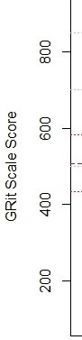
I am willing to give some meaning to the score by showing the ruler and some milestones along it. At this point, the scale score may be less meaningful than the milestones, but with experience, the scale score can become a useful shorthand for the milestones. It doesn’t take very much experience to understand what temperatures of 0°C and 37°C imply, even for US residents. This leads me to the less simple “map” below.

Dog walking scale (2)

Diagnosis With the Model

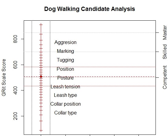
The vertical scale is GRits[3], which is our measure of dog walking proficiency and almost meaningless by itself; we wouldn’t lose much if we left the numbers off entirely[4]. The column of text labels is the substantive description of the scale. Topics at the low end, which are relatively easy, deal with type and use of basic equipment; topics at the high end, which are more difficult, deal with complex behaviors. The GRits bring precision; the text labels bring meaning.

The red vertical line has a tic mark for each possible raw score and a red diamond to mark the location of our hypothetical person. The red horizontal lines are the person’s location and plus/minus two standard errors. You can also add some normative information like means, standard deviations, frequency distributions, or quantiles, if you are into that sort of thing.

The gray horizontal lines mark the performance levels: 500 is Competent, 700 is Skilled, and 850 is Master. Labelling the lines rather than the regions between is not standard practice in educational assessment but it avoids the inconvenience of needing to label the region below Competent and the misinterpretation of the levels as actual developmental states or stages rather than simply more or less arbitrary criteria for addressing school accountability or dispensing certificates. So far we are just displaying the result, not interpreting it.

Control of the measurement model means, either, ensuring that we are warranted in treating the result as a valid measure, in the full sense of the word as we just did, or diagnosing what the anomalies tell us about the examinee. This is again the dichotomy of “diagnosing with the model” and “diagnosing from the model.” Determining which of these paths to follow requires a bit more than simply computing ‘infit’ or ‘outfit’ and consulting the appropriate table of big numbers. This involves looking at individual items, splitting the items into clusters, and looking for things that are funny. Maps like the following can be more useful than any fit statistic and almost number-free.

Dog Walking

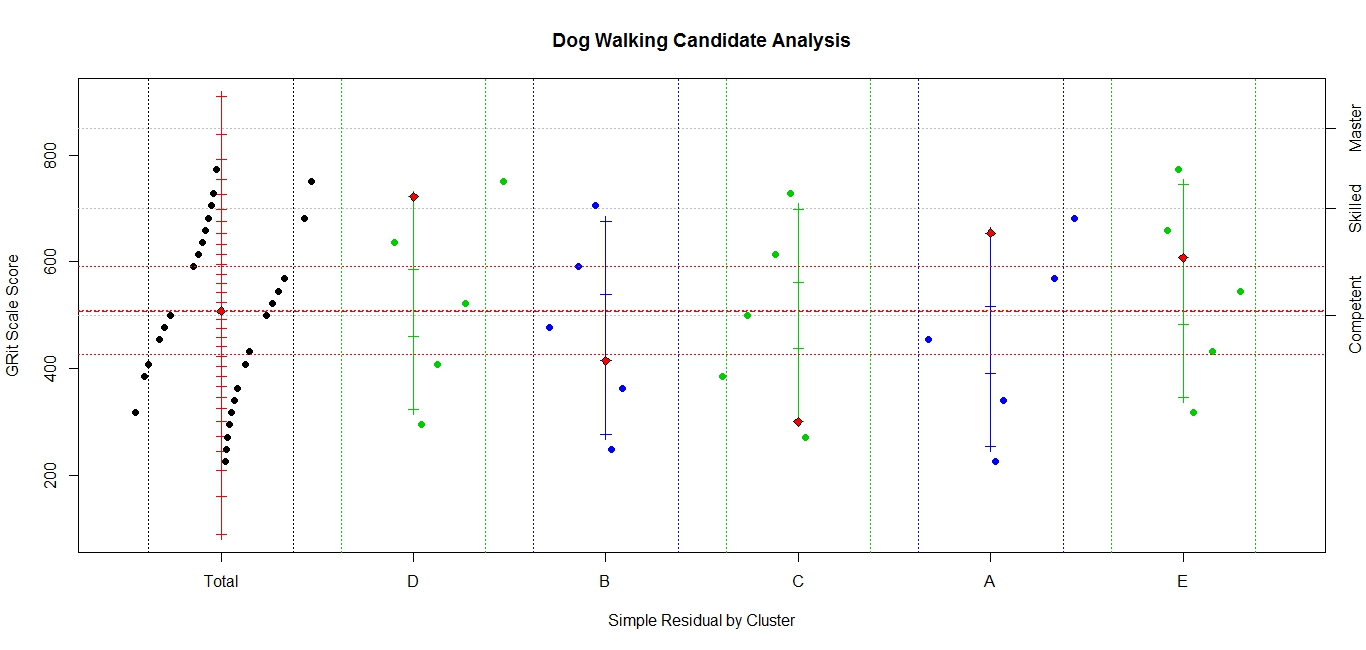
Diagnosis From the Model

The display has the same measurement information as before and considerable detail about items and item clusters. First, the red vertical line still refers to the total test and still has a tic mark for each possible raw score and the red diamond for the person. It now has a black diamond for each item response; items to the left of the line are incorrect; those to the right are correct with the distance from the line representing the probability against the response; the greater the distance, the more improbable the response. The dotted vertical lines (blue shading) are control lines and represent probabilities of 75%. We don’t need to be much concerned about anything in the blue. There are four or five items, two difficult items passed and two or three easy items missed, outside the control lines that might warrant investigation.

Most of the same information has been added for each of five item clusters. These are very short tests so the results may seem a little erratic but in all cases, one more item right or wrong would bring them close to the total test measure. If you are so inclined, the number correct score can be found by counting the tic marks[5] up to the red diamond. You can’t necessarily find it by counting the item plotting symbols to the right of the scales because they can represent multiple items. (And it is further confused because some items were not assigned to clusters.) Overall, this is a well-behaved person.

Because I often disparage anything short of computer-administered, fully adaptive tests (CAT), I need to point out a serious issue for me and model control: in the world of CAT, there are no surprises. If we do the CAT right, everything should be in the blue bands. This puts all the load for model control on the item clusters. In our example, we have behaved as though clusters were based on content, which is appropriate for reporting. For control, we would do more by forming clusters based on difficulty, sequence, item type, item format, and item exposure or age are natural choices but as we become more creative in developing items for computer administration, there could be others.

Interpretation of the measure means explaining what the measurement tells us about the status and progress of the examinee. Establishing ‘performance levels,’ say, Master, Skilled, or Competent dog walker, is a significant step from measurement to meaning, or from quantification to qualification. Announcing that the candidate is above, say, the ‘Competent’ performance level is a start. Diagnosis with the model would then talk about what items candidates at this level have mastery of, what items they have no clue about, and what items are at the candidate’s level. This is reporting what the candidate can do, what the candidate can’t do, and what the candidate should find challenging but possible. That suggests three obvious comments that any computer could readily generate as personalized feedback assuming a well-behaved response pattern and diagnosis with the model.

Personalizing a report takes more than generating text that restates the obvious and uses the candidate’s name in a complete sentence, like “Ron, your Dog Walking GRit is 509 ± 82, which means we think you are Competent to walk dogs”. When we have a computer generating the feedback, we should use any intelligence, artificial or otherwise, that is available. It is generally ok to start with the generic, “Ron, you total score is …” and “You did well on item clusters D and A, but were weak on cluster C,” and move on to things that are less obvious. I prefer to open with a positive, encouraging statement (clusters D and A), then mention problem areas (cluster C), and close with things to work on immediately (topics that haven’t been mastered but are close). Ideally, we would discuss the specifics of the surprising responses. This includes difficult items that were passed and easy items that were missed. This is moving into diagnosis from the model.

The more specifics, the better, even item statistics and foil analysis if anyone asks. But it would be much more valuable and much more work for both the item developers and systems analysts to provide a discussion of the type of misunderstandings or errors implied by any incorrect responses. It is work for the item developers because they would need to understand and explain why every distractor is there and what selecting it means. It is work for the system analysts because they need to keep track of and manage everything.

In today’s world, there is little reason to limit reporting to what can be squeezed onto an 8.5×11 sheet of paper or by concerns about the cost of color printing[6]. Paper copies are static, often cramped and overwhelming. Ideally, an electronic report, like an electronic test, will be interactive, dynamic, and engaging, with effective, targeted scaffolding. It should begin with the general overview and then allow the user to explore or be led through the interesting, important, and useful aspects of the responses, showing more and more detail as needed. Performance Level Descriptors and item clusters could be defined and displayed on request; item details could pop up when the plotting symbol is clicked.

This is not free; there will be resistance to giving items away because they are expensive and the item bank is sacred. Hopefully, we are moving away from once-a-year, high-stakes tests toward testing when it is helpful for the student, drawing from computer-generated and crowd-sourced item banks. And more importantly, toward immediate and informative feedback that might actually have some educational value.


[1] No, you didn’t pass, but if you test again with a parallel form, there is almost a 50% chance that you will.

[2] The little gray lines mark the performance levels (Competent, Skilled, and Master from left to right).

[3] Because GRits use three, rather than e, as their base, a difference of 100 GRits means 3 to 1 odds. Our hypothetical person has 3 to 1 odds of answering an item about leash tension but less than 1 to 3 odds for an item about tugging. More generally, a difference of 100k GRits means odds of 3k to 1. That’s friendlier than base e and odds like 2.71828…k to one.

[4] The report is (almost) number-free in the sense that the numbers are not needed to understand and use the results. It is not number-free in another sense because they are essential to provide the framework to create and arrange the display.

[5] This demonstration does not include tic marks for zero and perfect; in real life, you would probably have to account for them somehow. They tend to radically distort the scale without adding much, if any, information. They would extend the scale over 100 GRits in both directions and have probably ranges more than four times that in width.

[6] Someone will undoubtedly want a printer-friendly version to stick in the file cabinet because they have the file cabinet.

Viiif: Apple Pie and Disordered Thresholds Redux

A second try at disordered thresholds

It has been suggested, with some justification, that I may be a little chauvinistic depending so heavily on a baseball analogy when pondering disordered thresholds. So for my friends in Australia, Cyprus, and the Czech Republic, I’ll try one based on apple pie.

Certified pie judges for the Minnesota State Fair are trained to evaluate each entry on the criteria in Table 1 and the results for pies, at least the ones entered into competitions, are unimodal, somewhat skewed to the left.

Table 1: Minnesota State Fair Pie Judging Rubric

Aspect

Points

Appearance

20

Color

10

Texture

20

Internal appearance

15

Aroma

10

Flavor

25

Total

100

We might suggest some tweaks to this process, but right now our assignment is to determine preferences of potential customers for our pie shop. All our pies would be 100s on the State Fair rubric so it won’t help. We could collect preference data from potential customers by giving away small taste samples at the fair and asking each taster to respond to a short five-category rating scale with categories suggested by our psychometric consultant.

My feeling about this pie is:

0

1 2 3 4
I’d rather have boiled liver Can I have cake instead? Almost as good as my mother’s Among the best I’ve ever eaten

I could eat this right after a major feast!

The situation is hypothetical; the data are simulated from unimodal distributions with roughly equal means. On day one, thresholds 3 and 4 were reversed; on day two, thresholds 2 and 3 for some tasters were also reversed. None of that will stop me from interpreting the results. It is not shown in this summary of the data shown below, but the answer to our marketing question is pies made with apples were the clear winners. (To appropriate a comment that Rasch made about correlation coefficients, this result is population-dependent and therefore scientifically rather uninteresting.) Any problems that the data might have with the thresholds did not prevent us from reaching this conclusion rather comfortably. The most preferred pies received the highest scores in spite of our problematic category labels. Or at least that’s the story I will include with my invoice.

The numbers we observed for the categories are shown in Table 2. Right now we are only concerned with the categories, so this table is summed over the pies and the tasters.

Table 2: Results of Pie Preference Survey for Categories

Day

I’d rather have boiled liver Can I have cake instead? Almost as good as my mother’s Among the best I’ve ever eaten I could eat this right after a major feast!

One

10 250 785 83

321

Two 120 751 95 22

482

In this scenario, we have created at least two problems; first, the wording of the category descriptions may be causing some confusion. I hope those distinctions survive the cultural and language differences between the US and the UK. Second, the day two group is making an even cruder distinction among the pies; almost I like it or I don’t like it.

The category 4 was intended to capture the idea that this pie is so good that I will eat it even if I have already eaten myself to the point of pain. For some people that may not be different than this pie is among the best I’ve ever eaten, which is why relatively few chose category 3. Anything involving mothers is always problematic on a rating scale. Depending on your mother, “Almost as good as my mother’s” may be the highest possible rating; for others, it may be slightly above boiled liver. That suggests there may be a problem with the category descriptors that our psychometrician gave us, but the fit statistics would not object. And it doesn’t explain the difference between days one and two.

Day Two happened to be the day that apples were being judged in a separate arena, completely independently of the pie judging. Consequently every serious apple grower in Minnesota was at the fair. Rather than spreading across the five categories, more or less, this group tended to see pies as a dichotomy: those that were made with apples and those that weren’t. While the general population spread out reasonably well across the continuum, the apple growers were definitely bimodal in their preferences.

The day two anomaly is in the data, not the model or thresholds. The disordered thresholds that exposed the anomaly by imposing a strong model, but not reflected in the standard fit statistics, are an indication that we should think a little more about what we are doing. Almost certainly, we could improve on the wording of the category descriptions. But we might also want to separate apple orchard owners from other respondents to our survey. The same might also be true for banana growers but they don’t figure heavily in Minnesota horticulture. Once again, Rasch has shown us what is population-independent, i.e., the thresholds (and therefore scientifically interesting) and what is population-dependent, i.e., frequencies and preferences, (and therefore only interesting to marketers.)

These insights don’t tell us much about marketing pies better but I wouldn’t try to sell banana cream to apple growers and I would want to know how much of my potential market are apple growers. I am still at a loss to explain why anyone, even beef growers, would pick liver over anything involving sugar and butter.

VIc. Measuring and Monitoring Growth

The things taught in schools and colleges are not an education but the means of an education. Ralph Waldo Emerson.

There is no such thing as measurement absolute; there is only measurement relative. Jeanette Winterson.

#GrowthModels and longitudinal scales

We dream about measuring cognitive status so effectively that we can monitor progress over the student’s career as confidently as we monitor changes in height, weight, and time for the 100-meters. We’re not there yet but we aren’t where we were. Partly because of Rasch. Celsius and Fahrenheit probably did not decide in their youth that their mission in life was to build thermometers; when they wanted to understand something about heat, they needed measures to do that. Educators don’t do assessment because they want to build tests; they build tests because they need measures to do assessment.

Historically, we have tried to build longitudinal scales by linking together a series of grade-level tests. I’ve tried to do it myself; sometimes I claimed to have succeeded. The big publishers often go us one better by building “bridge” forms that cover three or four grades in one fell swoop. The process requires finding, e.g., third grade items that can be given effectively to fourth graders and fourth grade items that can be given to third graders, and onward and upward. We immediately run into problems with opportunity to learn for topics that haven’t been presented and opportunity to forget with topics that haven’t been re-enforced. We often aren’t sure if we are even measuring the same aspect in adjacent grades.

Given the challenges of building longitudinal scales, perhaps we should ponder our original motivation for them. For purposes of this treatise, the following assertions will be taken as axiomatic.

  1. Educational growth implies additional capability to do increasingly complex tasks.
  2. Content standards that are tightly bound to grade-level instruction can be important building blocks and diagnostically useful, but they are not the goal of education.
  3. Any agency will put resources into areas where it is accountable and every agency should be accountable for areas it can effect.
  4. Status Model questions that Standards-based assessment was conceived to answer are about school accountability and better lesson plans, e.g., Did the students finishing third grade have what they need to succeed in fourth grade; if not, what tools were they lacking?
  5. Improvement Model questions were added as annual grade-level data began to pile up in the superintendent’s office and are asking about the system’s improvement, e.g., Are the third graders this year better equipped than the third graders last year?
  6. Growth Model questions are personal, Is this individual (enough) better at solving complex tasks now than last year, or last month, or last week?

Continue . . . Longitudinal Scales

Previous                                                                      Shortcuts

VIb: Equating Multiple Links

As always, objectivity is specific to the threats eliminated.

Linking, Equating, and Bank Building

If we can equate two forms, we can equate multiple forms with multiple interconnections. We can use the same form-to-form analysis to proceed one link at a time until eventually the entire network is equated. Any redundancies can be used to monitor and control the process. For example, linking form A to form C should give the same result as linking form A to form B to form C. Or, alternatively, linking A to B to C to A should bring us back to where we started and result in a zero shift, within statistical limits. What goes up, must come down, or conversely. Perhaps inconveniently, perhaps usefully, multiple links will be inconsistent. This is either a problem for recognizing truth or an opportunity to gain understanding.

There is a straightforward least squares path to resolving any inconsistencies due to random noise.

Continue . . . Multiple Link Forms

Previous: Linking & Equating                                                                  Home

VI. Linking and Equating: Getting from A to B

To link, then to equate

It’s not possible to equate if you didn’t bother to link. In my language, to link means to physically connect; to equate means to do the arithmetic ensuring interchangeable logit scores. Equating is just another version of controlling the model so we could use everything we have just learned about controlling ourselves. But since we are looking for a different kind of answer, it is worth treating as its own topic.

Unleashing the full power of Rasch measurement means identifying, perhaps conceiving an important aspect, defining a useful construct, and calibrating a pool of relevant items that measure it over a meaningful range. So far we have concerned ourselves with processing isolated bunches of items. In this world, linking and equating item sets has been treated as a distinct and unique phase in the process from conception to measurement. With the technology available, this has typically been the most convenient and efficient approach, and may continue to be so.

In the new world, post fixed-form, paper-based instruments, which are more and more passé, building a calibrated pool can be an inherent and natural part of the process and not a separate step. Calibration procedures allow us to combine individual level test data across administrations, perhaps years apart, to check if specific objectivity holds across time or distance. This is just another between-groups comparison, which gives more opportunities for control and investigation of the process.

Continue . . . Linking and Equating

Previous: Measuring & Diagnosing                                          Home: Rasch’s Theory of Relativity

Vd. Measuring, Diagnosing, and Perhaps Understanding Objects

Measurement when the data fit; diagnosis when it doesn’t

Our purpose when undertaking this venture was not to explain data or even to build better instruments. It may not seem like it based on the discussion so far but our objective is say something useful about the objects. Although the person and item parameters have equal status in our symmetrical model, they aren’t equally important in our minds. The items are the agents of measurement; the person is the object.

Continue . . . Vc. Diagnosis with and from the Model


Previous: Beyond Outfit                   Next: Getting from A to B

Vb. Mean Squares; Outfit and Infit

A question can only be valid if the students’ minds are doing the things we want them to show us they can do. Alastair Pollitt

Able people should pass easy items; unable people should fail difficult ones. Everything else is up for grabs.

One can liken progress along a latent trait to navigating a river; we can treat it as a straight line but the pilot had best remember sandbars and meanders.

More about what could go wrong and how to find it

However one validates the items, with a plethora of sliced and diced matrices, between group analyses based on gender, ethnicity, ses, age, instruction, etc., followed by enough editing, tweaking, revising, and discarding to ensure a perfectly functioning item bank and to placate any Technical Advisory Committee, there is no guarantee that the next kid to sit down in front of the computer won’t bring something completely unanticipated to the process. After the items have all been “validated,” we still must validate the measure for every new examinee.

The residual analysis that we are working our way toward is a natural approach to validating any item and any person. But we should know what we are looking for before we get lost in the swamps of arithmetic. First, we need to make sure that we haven’t done something stupid, like score the responses against the wrong key or post the results to the wrong record.

Checking the scoring for an examinee is no different than checking for miskeyed items but with less data; either would have both surprising misses and surprising passes in the response string. Having gotten past that mine field, we can then check for differences by item type, content, sequence to just note the easy ones. Then depending on what we discover, we proceed with doing the science either with the results of the measurement process or with the anomalies from the measurement process.

Continue . . .Model Control ala Panchapekesan


Previous: Model Control ala Choppin                        Next: Beyond Outfit and Infit

V. Control of Rasch’s Models: Beyond Sufficient Statistics

 No single fit statistic is either necessary or sufficient.  David Andrich

You won’t get famous by inventing the perfect fit statistic. Benjamin Wright[1]

That’s funny or when the model reveals something we didn’t know

You say goodness of fit; Rasch said control. The important distinction in the words is that, for the measure, once you have extracted, through the sufficient statistics, all the information in the data relevant to measuring the aspect you are after, you shouldn’t care what or how much gets left in the trash. Whatever it is, it doesn’t contribute to the measurement … directly. It’s of no more than passing interest to us how well the estimated parameters reproduce the observed data, but very much our concern that we have all the relevant information and nothing but the relevant information for our task. Control, not goodness of fit, is the emphasis.

Rasch, very emphatically, did not mean that you run your data through some fashionable software package to calculate its estimates of parameters for a one-item-parameter IRT model and call it Rasch. Going beyond the sufficient statistics and parameter estimates to validate the model’s requirements is where the control is; that’s how one establishes Specific Objectivity. If it holds, then we have a pretty good idea what the residuals will look like. They are governed by the binomial variance pvi(1-pvi) and they should be just noise, with no patterns related to person ability or item difficulty, nor to gender, format, culture, type, sequence, or any of the other factors we keep harping on (but not restricted to the ones that have occurred to me this morning) as potential threats. If the residuals do look like pvi(1-pvi), then we are on reasonably solid ground for believing Specific Objectivity does obtain but even that’s not good enough.

It does not matter if there are other models out there that can “explain” a particular data set “better”, in the rather barren statistical sense of explain meaning they have smaller mean residual deviates. Rasch recognized that models can exist on three planes in increasing order of usefulness[2]:

  1. Models that explain the data,
  2. Models that predict the future, and
  3. Models that reveal something we didn’t know about the world.

Models that only try to maximize goodness of fit are stuck at the first level and are perfectly happy fitting something other than the aspect you want. This mind-set is better suited to trying to explain the stock market, weather, or Oscar winners and to generate statements like “The stock market goes up when hemlines go up.” Past performance does not ensure future performance. They try to go beyond the information in the sufficient statistics, using anything in the data that might have been correlated and, to appropriate a comment by Rasch , correlation coefficients are population dependent and therefore scientifically rather uninteresting.

Models that satisfy Rasch’s principle of Specific Objectivity have reached the second level and we can begin real science, possibly at the third level. Control of the models often points directly toward the third level, when the agents or objects didn’t interact the way we intended or anticipated[3]. “The most exciting phrase to hear in science, the one that heralds new discoveries, is not ‘Eureka!’ but ‘That’s funny.’” (Isaac Asimov.)

Continue reading . . . Model Control ala Choppin

[1] I chose to believe Ben’s comment reflected his attitude toward hypothesis testing, not his assessment of my prospects, although in that sense, it was prophetic.

[2] Paraphrasing E. D. Ford.

[3] “In the best designed experiments, the rats will do as they damn well please.” (Murphy’s Law of Experimental Psychology.)

Previous: Doing the Math                                Next: Model Control ala Panchakesan